


Retro Mode - Icon Pack (Neon)
Moertel Pixel Art
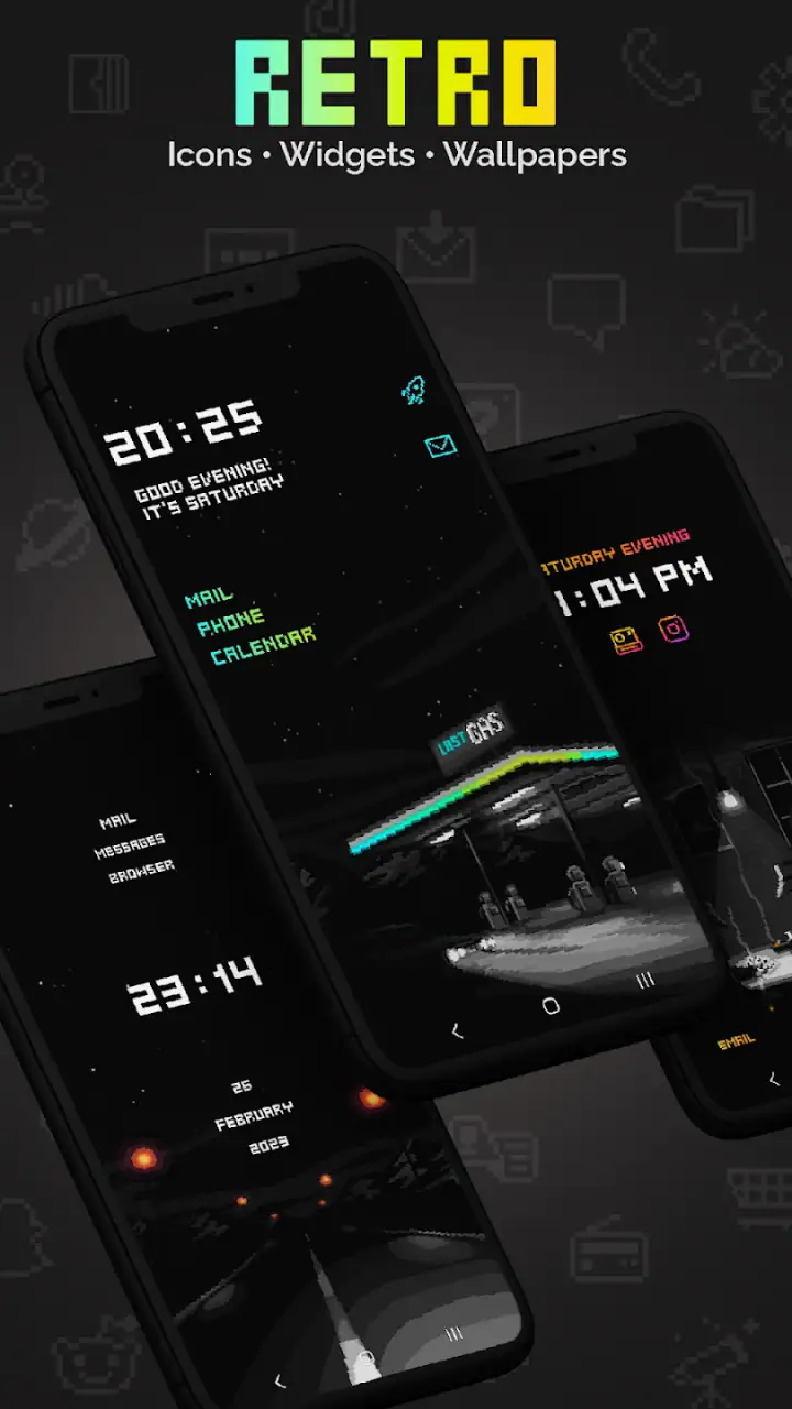
I approached Retro Mode - Icon Pack (Neon) as a personalization tool rather than a complete phone makeover. Its appeal is easy to understand: handcrafted pixel-art icons, widgets, and wallpapers give an Android home screen a deliberately old-school look instead of the polished, gradient-heavy style found in many current themes. After spending time with it, I found the strongest results came from treating the pack as part of a small visual system, not as something to apply once and forget.
The app is made by Moertel Pixel Art and sits in the personalization category. It costs $2.79, carries an Everyone 10+ content rating, and has built a solid audience with a 4.6 average from around 2.6K ratings. That combination tells me it is aimed at people who already know they want a distinctive aesthetic. It is not trying to be a universal launcher replacement or a productivity utility. It is for making the parts of your phone you see every day feel more personal.
Where the first setup can get stuck
The first point of friction is understanding what an icon pack actually changes. Installing the app does not necessarily mean every icon on the phone will instantly become pixel art. The pack has to be used through a compatible launcher or an icon-setting workflow supported by the phone. That distinction matters, especially if you expect the app itself to control the whole home screen.
In my experience, the most reliable approach is to decide which launcher currently controls the home screen before opening the pack. If your phone uses its manufacturer launcher, the available icon options may not be the same as those on a third-party launcher. This is not a flaw unique to Retro Mode; it is a general limitation of Android customization. Still, it is the first place where expectations can collide with reality.
Another common snag is partial coverage. A themed pack may recognize popular applications while leaving less common, newly installed, or region-specific apps untouched. That can create a mixed row of bright pixel icons and ordinary modern ones. I actually prefer this to a misleading promise that every app will match, because it gives you a chance to decide whether a manual workaround is worth the effort. If visual consistency is your priority, check your most-used apps first rather than judging the entire pack from a single unfamiliar icon.
Related News

Why WhatsApp Messenger Still Makes Everyday Communication Feel Easy

Jurassic World: The Game Is the Better Dino Tycoon for Strategic Players

Threads in Real Life: Who Should Join, Lurk, or Leave

How SHEIN Turned Shopping Into an Endless Content Feed

How to Make Fortnite Feel Smarter on Mobile

Should You Switch to Microsoft Outlook on Mobile?
Widgets and wallpapers also need to be considered separately from icons. A wallpaper can be applied through the normal phone wallpaper picker, while a widget is placed through the home-screen widget menu. The icon pack may be present on the device, but those three elements do not necessarily install as one automatic theme. Thinking of them as separate layers makes the setup much less confusing.
The short description, “Retro Mode,” is accurate but deliberately brief. The real character comes from the pixel treatment: hard edges, limited-looking color choices, and a neon-leaning retro mood. That style can look excellent against a restrained background, but it can become visually noisy if you combine it with a busy wallpaper, colorful widgets, and several unrelated launcher effects.
What I check before changing the home screen
Before applying anything, I take a screenshot of the current layout. This is a simple habit, but it saves time if the launcher rearranges icons or if I decide the new look is not practical. I also note which pages contain folders, because icon changes can make familiar folders less immediately recognizable when every symbol takes on a new visual language.
Gallery
It is worth checking the operating-system requirement as well. Retro Mode supports Android 9 and newer, so an older device may not be able to use it at all. On a supported phone, I would still make sure the Play Store installation has completed fully before judging whether the pack is available inside the launcher. A half-finished installation or a launcher that has not refreshed can look like an app failure when it is simply a setup delay.
The current version is 2.1.0, and that is useful context when troubleshooting. If the app is installed but does not appear in the launcher’s icon-pack list, I would first close and reopen the launcher, then restart the phone before doing anything more drastic. Those are safe, reversible checks that often refresh the list of available customization packs without risking the rest of the layout.
I would also confirm that I am editing the actual home screen rather than a lock-screen theme, notification style, or wallpaper-only menu. Android manufacturers place these controls in different locations, and the terminology is not always consistent. The app can be working correctly while the wrong customization panel is open.
Making the neon style readable
The most useful design decision is choosing where to let the color stand out. I found that a darker, less detailed wallpaper gives the icons room to breathe. If the wallpaper contains bright patterns behind small icons, the result can look attractive in a screenshot but tiring during ordinary use, particularly when searching for an app quickly.
I would start with one home-screen page instead of changing every page at once. This creates a practical comparison: the pixel-art page shows the personality of the pack, while the unchanged page remains a reference for speed and familiarity. It also helps answer a question many users have before paying for a personalization app: will the novelty remain enjoyable after the first day?
Folders deserve special attention. A folder full of themed icons can look coherent when closed, but once opened, the smaller symbols may require a moment more recognition than familiar stock icons. I prefer grouping apps by task and keeping the most frequently used ones in consistent positions. That way the visual style changes, but the muscle memory does not.
The best result is not the most decorated screen; it is the screen where the pixel style remains recognizable without slowing down everyday actions. That is the trade-off I kept returning to while using the pack.
Recovering the workflow when something looks wrong
When an icon does not change, I would not immediately uninstall the app. First, I would check whether the launcher supports third-party icon packs and whether the pack has been selected in the launcher’s appearance settings. If only one or two icons remain unchanged, the issue is more likely coverage than a failed installation.
When many icons remain unchanged, the launcher is the more likely place to investigate. Some launchers apply packs globally; others require selecting the pack from a theme or appearance screen. A launcher update can also move this control. The safe workflow is to reopen the launcher’s customization menu, select Retro Mode again, and give the home screen a moment to redraw before changing several other settings.
If the home screen becomes disorganized, I would restore the saved layout or use the screenshot taken before setup as a guide. Avoid changing icon size, grid spacing, wallpaper, and launcher at the same time. One change at a time makes it much easier to identify what caused the problem. This is especially important with personalization apps because the visible result is controlled by several Android components, not just the icon pack.
For a widget that does not appear, I would use the ordinary home-screen widget picker and look for the app there rather than assuming it belongs in the icon-pack menu. If it is visible but cannot be placed, freeing space on the chosen page or trying another page is a sensible next step. Widgets often need a clear rectangular area, and a crowded layout can make placement seem unavailable.
Wallpaper problems should be handled independently. Reopen the phone’s wallpaper selector, choose the image again, and check whether the phone is applying it to the home screen, lock screen, or both. If the image looks cropped, that may be the launcher’s scaling behavior rather than a defect in the artwork. Trying a different crop or a less crowded page can produce a better result without abandoning the pack.
There is also a financial detail worth noticing. The app is listed at $2.79 and also shows in-app purchase items ranging from $1.99 to $32.99 per item. I would review the purchase screen carefully before confirming anything, particularly if I am exploring optional content or restoring an earlier purchase. The practical lesson is simple: know whether you are paying for the app itself, an additional item, or both before tapping through the store flow.
When the app may not be the cause
Sometimes the problem is the phone’s launcher, not the artwork. Manufacturer launchers can limit how third-party packs are applied, and some phones present customization features through their own theme systems. If the pack works in one supported launcher but not another, that points toward launcher compatibility rather than a damaged installation.
Performance can also be misunderstood. A wallpaper with strong contrast or a crowded home screen may feel visually busy even when the phone is operating normally. If scrolling feels slow, I would temporarily use a simpler wallpaper, remove a few widgets, and compare the result. This separates the visual load of the layout from the icon pack itself.
Storage and system maintenance can create misleading symptoms too. If an installation is incomplete, the app may not appear where expected. If the launcher cache is stale, an icon selection may not show immediately. Restarting the phone, reopening the launcher, and checking the app’s store page for a completed installation are reasonable first steps. I would avoid clearing launcher data unless I was prepared to rebuild the home screen, because that can remove more than the original problem.
Notifications and default icons are another source of confusion. An app shortcut on the home screen may change while an icon shown inside a notification, settings screen, or system panel remains unchanged. Those areas are controlled by Android or the individual application, so a themed home screen should not be expected to replace every symbol throughout the operating system.
The same principle applies to newly installed apps. A new application may not be recognized immediately, or it may not have a matching design in the pack. That does not make the existing icons less useful. I would keep the unmatched app in a folder or place it on a secondary page until I decide whether the visual difference bothers me enough to use a custom shortcut.
Who will enjoy the workflow, and who should skip it
This app suits someone who enjoys deliberate customization and does not mind spending a little time arranging the result. It is particularly appealing if you like pixel art, retro games, neon accents, or an Android home screen that feels visibly different from the default. The combination of icons, widgets, and wallpapers gives more room for a unified look than an icon-only pack would.
It is also a good fit for a secondary device, a gaming phone, or a personal phone where personality matters more than a completely neutral interface. I can imagine using it on a weekend project: install the pack, choose a dark background, create folders for communication and media, and leave work-related tools on a simpler page. That arrangement keeps the theme enjoyable without making every task feel like navigating an arcade cabinet.
I would be more cautious recommending it to someone who wants one-tap, system-wide theming. If you dislike adjusting launcher settings, checking unmatched icons, or balancing wallpaper contrast, the setup may feel like unnecessary work. People who depend on highly recognizable stock icons may also prefer a cleaner minimalist pack, because the retro treatment changes the visual cues they use to identify applications.
It is not the best choice for an iPhone user either, since the stated minimum operating system is Android 9. More broadly, anyone looking for a launcher, a complete lock-screen replacement, or a tool that redesigns every system interface should look elsewhere. This is a focused personalization app, and its value comes from that focus.
How it compares with ordinary alternatives
The usual alternative is to keep the default icons and change only the wallpaper. That is faster and less likely to create compatibility questions, but it also produces a weaker sense of identity. Retro Mode goes further by changing the repeated visual elements you interact with every time you open the phone. The cost is that the setup requires more attention and may expose gaps where an app is not represented.
Another alternative is a generic icon pack with a flatter or more neutral design. That option may blend more easily with different wallpapers and make unfamiliar apps less conspicuous. Retro Mode is more opinionated. Its pixel-art direction is the reason to choose it, but also the reason it will not suit every home screen. If you want subtle refinement, the neon retro look may feel too strong; if you want a theme people notice, that same boldness is its advantage.
A full launcher theme can offer deeper control over grids, gestures, folders, and transitions. That may be better for someone who wants to redesign how the phone behaves. Retro Mode is preferable when the main goal is visual character without committing to a completely different launcher experience. I see it as a layer for the home screen rather than a replacement for Android’s navigation habits.
My practical verdict after living with the style
Retro Mode - Icon Pack (Neon) works best when approached as a curated visual project. The artwork has a clear identity, and the pack can make an ordinary Android screen feel more playful and personal. I appreciate that it offers more than a single icon treatment by bringing widgets and wallpapers into the same retro direction, even though each part still needs to be handled through the appropriate Android controls.
The friction is real: launcher support matters, coverage may be uneven, and a busy combination of neon artwork can reduce quick readability. The additional purchase range also means I would pay attention during checkout instead of assuming every piece is included in the initial price. None of these points makes the app a poor choice, but they do make it a better recommendation for patient customizers than for people seeking instant automation.
With around 50K installs, it has clearly found an audience, while its 4.6 average suggests that the distinctive style connects with many users. My own recommendation is straightforward: choose it if you genuinely like pixel art and are willing to spend a few minutes checking your launcher, arranging folders, and balancing the wallpaper. Start with one page, keep a record of the original layout, and add visual elements gradually.
For a retro-minded Android home screen, this is a worthwhile paid personalization choice; for effortless, universal theming, it is the wrong tool. That distinction sums up the experience. When the style matches your taste, the setup effort feels like part of the fun. When it does not, the same setup steps become friction with little reward.
FAQs for Retro Mode - Icon Pack (Neon)
What is Retro Mode - Icon Pack (Neon)?
Retro Mode - Icon Pack (Neon) is an Android customization app that replaces standard app icons with bright, retro-inspired neon designs. Its visual style is aimed at users who enjoy glowing colors, arcade aesthetics, and nostalgic home-screen themes. After installing it, you typically apply the icons through a compatible launcher rather than changing the entire phone interface automatically.
How do I apply the icons from Retro Mode - Icon Pack (Neon)?
To use the icon pack, install it and open the app to check the available launcher options or application instructions. Most icon packs require a supported third-party launcher, such as a launcher with icon-pack settings. From that launcher’s customization menu, select Retro Mode - Icon Pack (Neon), then apply the pack. The exact steps can vary depending on your phone model and launcher.
Is Retro Mode - Icon Pack (Neon) compatible with every Android phone and launcher?
Compatibility depends mainly on the launcher installed on your Android device. The icon pack may work correctly with many popular launchers, but it is not guaranteed to support every manufacturer’s default launcher or every custom home-screen application. Before downloading, check the app’s compatibility information and confirm that your preferred launcher supports third-party icon packs and manual icon replacement.
Does Retro Mode - Icon Pack (Neon) change all app icons automatically?
The pack can provide themed icons for many popular applications, but coverage is not always complete. Less common, newly released, or region-specific apps may remain unchanged and require a custom icon or manual replacement. Depending on the launcher, you may also be able to request missing icons, use alternative designs, or apply the neon theme only to selected applications for a more personalized layout.
Is Retro Mode - Icon Pack (Neon) free to use, and does it include ads or extra purchases?
The availability of free features, advertising, and optional purchases can depend on the version distributed through the app store. Review the current store listing before installing to see whether the pack is completely free, supported by ads, or includes premium content. Also remember that a compatible launcher may be required, and some launchers offer their own free or paid customization features.
Pros
- Bright neon icons give home screens a distinctive retro-futuristic style.
- Works with many popular Android launchers for flexible customization.
- Includes matching wallpapers to complement the icon design.
- Regular icon updates can expand coverage for newer apps.
- Simple setup makes applying the pack quick for supported launchers.
Cons
- Some apps may lack custom icons and require manual icon requests.
- Best results depend on using a compatible third-party launcher.
- Neon artwork may reduce readability for users who prefer subtle designs.
- Certain wallpapers or features may require an additional purchase.
- Icon updates and launcher compatibility can vary by device and Android version.


